Many learners use short games to relax between lessons. A quick break only feels good when the phone stays tidy and the download is safe. The trick is not secret knowledge – it is slow reading, simple checks, and a habit of ignoring flashy promises. This guide explains how to scan a game installer page in calm, easy English, so the right file lands on the device and nothing noisy follows it home.
Before You Tap: Read The Page Like A Teacher
Good pages explain themselves. Look for sentences that describe the app, its creator, and the version available. A helpful page often invites you to read more about the build before any file is touched, which is a friendly sign. Pause for ten seconds. Find the full app name, the version number, and a short, clear description. If the text is honest and the steps are simple, confidence rises. If the words feel rushed, or if the page shouts about “exclusive” features without details, attention should rise instead.
A Short Checklist Learners Can Trust
These items are easy to spot and even easier to remember.
- One button, one action – a clear page has a single download button that matches the text above it.
- Consistent names – the app title and the file name should match. Random extra words like “final_new_fixed” suggest a repack.
- Version shown in writing – numbers like 1.4.2 are normal. A file with no version on the page hides useful context.
- Size stated up front – pages that show expected megabytes respect the reader. Big surprises after tapping into waste data and time.
- Plain permissions – if a page lists permissions, they should match simple needs such as network access. Requests for messages or call control are not routine.
- No forced group hop – safe pages do not make visitors join a chat before revealing the file.
Ticking four or more of these lines usually marks a safe route. Missing many of them means the page is not worth the risk.
Vocabulary Cues That Signal Clarity
Language gives away intent. Honest pages use concrete verbs – “download”, “install”, “update” – and pair them with short steps. Unclear pages lean on vague praise – “ultimate”, “super”, “premium” – without facts. Look for everyday nouns that match normal app life: “version”, “release date”, “changelog”, “support”. These words inform the reader that the page monitors changes and takes questions seriously. Watch for verbs that push urgency instead of sense – “grab now”, “last chance”, “only today”. Such phrases are built to rush decisions. Calm English and steady instructions are better guides than hype.
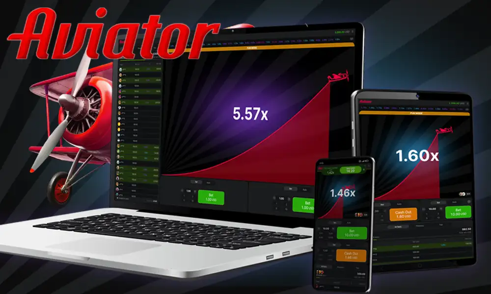
Pictures That Tell The Truth
Images speak, but they must speak clearly. Trust rises when screenshots show the real interface with clean edges and consistent fonts. A good page keeps borders straight and time stamps in order. Pictures that appear stretched, oddly cropped, or filled with stickers often hide more than they reveal. If a gallery repeats the same image with different filters, it is decorating, not informing. Readers can ask one simple question: “Does this image help understand the app?” If the answer is no, the file deserves more caution.
Layout Signs That Help Learners Navigate
Strong pages use a simple structure. The title sits at the top. A short block describes the app. A single button follows. Then come details: version, size, last update, and notes. This order reduces confusion. Pages that stack three download buttons above the description want fast clicks, not careful reading. A tidy footer with contact details and policy links adds trust, as it indicates the publisher is open to feedback and questions. When a page hides these basics, the file behind it is often messy too.
How To Compare Two Pages Without Tech Skills
Sometimes two links arrive in the same chat. A calm comparison works in plain steps. Read the opening paragraph on each page. The stronger one uses full sentences and complete names. Next, scan for the version and size. If only one page shows both, the choice is easy. Then look at the button. The safer page labels it with the app name instead of a generic “Start”. Finally, glance at the permissions section or FAQ. If one page lists normal prompts while the other skips the topic, go with the page that treats readers like partners, not targets.
When The Words Feel Wrong
Not every warning is technical. If a page reads like a sales pitch with no facts, close it. If the button jumps around or new windows open without consent, close it. If a timer counts down and calls the reader “lucky” for arriving in time, close it. These are language tricks, not helpful signs. A good installer page behaves like a polite host – it explains, then it offers. It does not chase.
A Tidy Finish That Prevents Future Hassle
After a safe file is chosen, keep the result tidy. Save the installer with a clear name – for example, app_title plus the version number. Place it in a small “Installers” folder instead of leaving it in the general downloads list. Install once. Then delete the file so it does not get tapped again by mistake. Open the app, ensure alerts are quiet, and only keep permissions that make sense for play. A light routine like this turns future updates into a quick task rather than a hunt through crowded folders.
A Better Habit Than Luck
Clear English, slow reading, and small checks beat guesswork. The right page explains itself. The right file matches its name. The right steps feel steady rather than rushed. Learners who build this habit make safer choices without memorizing technical rules. Games stay fun. Phones stay calm. And study breaks remain short, relaxed, and free of download drama.